Tag Archives: Chicago Manual of Style

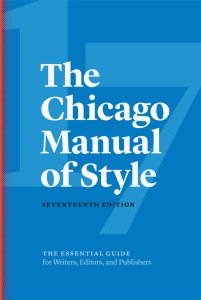
The Chicago Manual of Style Announces 17th Edition

Today in word nerd news, the world learned that September will bring a new edition of the Chicago Manual of Style (CMOS)! The University of Chicago Press is already taking pre-orders. Spoiler alert: it costs $70.

More spoiler alerts: e-mail will be email and Internet will be internet! Gender fluidity will the conversation, too, as they report “use of the singular they as a preferred personal pronoun [will be] accepted in formal writing.” The times, they are a-changin’.

I managed to nab a $25 used copy of the 15th edition at Powell’s about five years before I was forced to upgrade to a new copy. MPub required us to have a copy of 16, which had just been released, so I purchased one at full retail price. (Of course there’s also my early edition of CMOS I scored in for $1.50. I wouldn’t part with it for the world!)

We’ve been through a lot, me and ol’ 16. There was at least one late night I needed to read most of the first chapter for editing class, which describes details about publishing as a whole. (Quick, someone quiz me on verso and recto!) As a reference, it felt a little awkward to be reading the book in front-to-back style.

Sadly, my current workplace just doesn’t beg the kinds of style questions I ache to research, so I haven’t been relying upon 16 as regularly as I have in the past. What do I do? I could sell the tome back to Powell’s now for maximum cash (which would then in turn be used to pre-order 17). Or maybe it’s time to start a CMOS collection, so I can research subtle changes that happened between editions.

What’s a word nerd to do?

Advertisement

Leave a comment

Filed under books

Happy Holidays from Bookish

Happy holidays from Bookish!

I hope my readers—hi, spambots!—are having an excellent holiday season filled with opportunities to enjoy an engaging book next to a fire or under a blanket.

Things have been crazy at Bookish HQ the last two months, resulting in few new blog posts. This trend may continue—Bookish may soon be embarking on a capital campaign and/or finding a new HQ. These things do not come easy, but the blogging will continue whenever possible.

I’ve been doing some reflecting on literary themes as well, and hope to serve up a year-in-review next week. Watch for it!

There is a bit of a story behind the photo. Earlier this week the Chicago Manual of Style released a guide to making a CMOS mini-book ornament. When I decided to take a few minutes on Friday morning to make one, I discovered a contest they were running. A half hour later, I had a garland of mini-CMOSes and a photo that they shared online

Leave a comment

Filed under books

Midwestern Bible: Preachin’ the Chicago Manual of Style

Senseless bickering is one of my least favorite things to be around. And in the MPub program, if there was one way to guarantee a testy exchange, it was to insert an Oxford comma into a group project document. Even if you were the designated copy editor, other group members would alter the source document to reflect your changes, and varying personal styles within the group would soon come to a head. A heated five minute discussion could be born out of whether the word is free mason, free-mason, or freemason. (Bonus point if you noticed the Oxford comma in that list!)

It’s not like that in the real world though, right? RIGHT?

Sadly, I’ve encountered institutions saying that they generally adhere to a widely-accepted style (usually Chicago Manual of Style or AP Stylebook), when practice may indicate otherwise. Unless they have a written style sheet of their own, or at minimum can explain what their rules are to you, it becomes very difficult to edit copy for consistent style. Then there are the places where different departments use different standards and don’t talk to each other about it…!

Perhaps the bickering wasn’t so bad. At least that meant that people were informed and truly cared.

As you may be able to tell by the photo, my preferred house style is Chicago. Since 2003 I’ve spent a good deal of time working with the book and familiarizing myself with the details of their approach. One example: researching various approaches to how minority groups are named (African Americans? African-Americans? Afro-Americans? Blacks?) for the curator of a high-profile, potentially controversial museum. Chicago’s goal is academic clarity—a goal I can get behind—whereas AP style was born of a desire to save space and use less newsprint.

After spilling blood, sweat, and tears familiarizing myself, I’ve become pretty passionate about the Chicago Manual of Style. Thus, my pet name: “Midwestern Bible.”

So what do you think happened when I recently saw an early edition of Chicago, titled A Manual of Style with Specimens of Type, at a Missoula thrift store?

I gasped. I snatched. I read the tag. A green tag—that means it’s 50% off today! Meaning this baby’s only…$1.50!

Now, I already have far too many books. On this day, I justified the purchase by telling myself I knew plenty of other people who would be wild about getting this as a gift if I decided to part ways with it. And yet here I am, taking photos of this early edition of Chicago to make it look like it has a halo. Here’s a photo of the stylized bookplate in the front. And here’s one of the many pages of type specimens. And the original purchase information. And a page of University of Chicago Press seals! It’s a gorgeous book—being the grandfather of my well-loved reference book makes it even sweeter.

Something tells me I won’t be getting rid of this one for a while.

3 Comments

Filed under books, history

Changing of the Guard: Chicago Manual of Style

Despite a love of the Chicago Manual of Style (or as I like to call it, “Midwestern Bible”) I’m not very excited to have just gotten the new 16th edition.

Last month I bought it from Powell’s and had it shipped to my mom, who schlepped it up for me this weekend. Reluctantly, I gave her my 15th edition to take home and sell back to Powell’s when she has time.

To commemorate this historic event, I took a photo of the two compendiums passing in the night.

Ol’ 15 and I had some pretty good times. I bought her slightly used for a mere $25, a significant savings off the hefty list price. We worked on the Muhammad Ali Center together–a pretty major undertaking that intimately familiarized me with Chicago. We continued work on many other projects that I still have pride in having been involved with. Despite not being a fan of orange, I loved the bright color and the stylish look and feel of the cover. I used 15 so much I even uncovered (and of course flagged in case I needed to prove) multiple typos inside!

While I enjoy how 16 changed Chicago’s standard from “Web site” to “website,” our courtesies ended there, and we’ve been on the wrong foot ever since. I didn’t enjoy not knowing until I had moved to BC that I’d need to buy the latest edition (even though our program doesn’t require us to have the just-released Adobe Creative Suite 5). I had already purchased all my books from Powell’s, and buying 16 required more money ($65!), and more patience for it to arrive. The dust jacket design is craptacular, sporting a turquoise background for the front cover and spine, and then an abrupt change to orange on the back. Jarring. Sure, I don’t mind turquoise, but the combination of turquoise and orange screams to me that Chicago is trying to be “hip,” like seeing powder blue put together with chocolate everywhere a few years back. After a few late nights writing my 20-page paper this term, I suspect my retinas will be screaming in agony.

Goodbye, ol’ 15, I’ll miss you and our warm memories. Just another thing I’ve had to involuntarily sacrifice on this ill-conceived journey.

Leave a comment

Filed under books